

heart to home meals
Making life easier for seniors... one meal at a time.
When Wiltshire Farms UK decided to grow their franchises into North America, there was a lot on the line. The UK parent office was investing heavily, and demanded success. To get things started, they rebranded with a more North American-centric name and new logo that would better describe their offering: Heart to Home Meals.
Together, Scott Moore of Stir Creative Communications and I, dug in.
Our task: Build a visual and communication strategy targeted to a very special market and grow sales incrementally.
We worked on the entire marketing communication system including direct mail, catalogs, commercials and even their labels and trucks.

We helped Heart to Home Meals to articulate their brand positioning:
“Life should get easier as you age”
This quickly became more than a positioning statement. It became a success metric for every aspect of their relationship with customers… from how the operators speak on the phone, to how information is organized on their labels, to the surface of the paper used in the menu covers. Yes, everything. I’ll get to the paper surface in a moment.
What’s great about Heart to Home Meals is that it recognizes the physical AND emotional needs of seniors.

When developing the biannual catalog, for example, we completely redesigned it from the ground up, understanding that contrast, font style and size, accurate photography and information, all help seniors read and understand the content better.
But we didn’t stop there. Because we know that eating is as emotional as it is physical. We turned Heart to Home Meals’ product catalog into a magazine-style menu. The structure and format is familiar to our audience as a beautiful foodie magazine, complete with a letter from the chefs and regular columns about health and nutrition. We even added a sudoku and crossword puzzle.
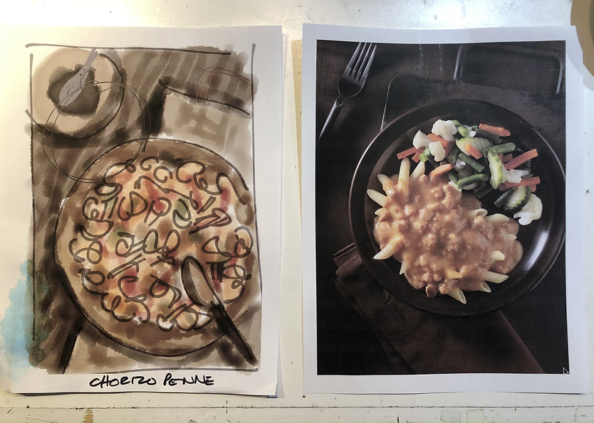
Every menu item is beautifully photographed, as realistically as possible, to ensure an accurate representation of the food they receive. We weigh everything before it’s simply styled. We even count the carrots.
Our marketing speaks to seniors about the choices they CAN MAKE, not the things they CANNOT DO. Because no matter how old you are, no one wants to be told they can’t do something. So, if they choose not to cook, or go out shopping, there is an option. And that has made all the difference to Heart to Home Meals, and its customers.
These tactics have resulted in an 8-fold growth in franchisees across Canada, with a test location in the US, in just 5 years, and consumer sales growth that resulted in a move to a larger kitchen facility in Ottawa, and the purchase and take-over of their largest competitor.
Oh, regarding the paper choice for the Menu? We avoided a super smooth surface and chose a matte finish that has some texture, so it would not slide off the reader's lap.


